Far Out There Christmas Videos – page 10
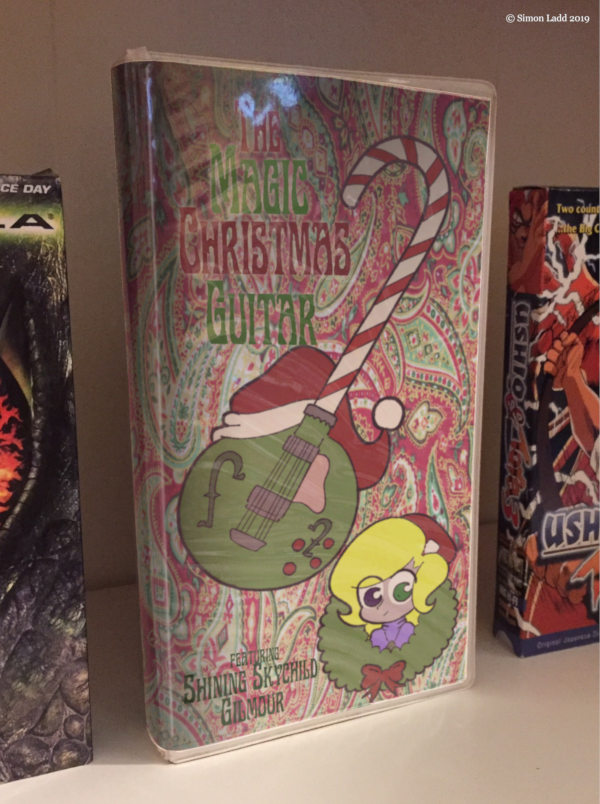
Okay, I said yesterday’s was my favorite, but I think this one might have it beat. On the one hand, the wrinkly reflections kind of obscure the text, but on the other hand YOU CAN ACTUALLY SEE THE WRINKLY REFLECTIONS! I really didn’t expect that effect to work out as well as it did. My blatant fakery skills continue to improve!
Also, check out a rare usage of Skye’s actual name, which I GUARANTEE she wasn’t happy to see.
(Historical Notes: …and after all this time, I’m STILL proud of how that particular bit of multi-layered trickery turned out. I pulled the original cover out of the case and stuck a plain white sheet in, then turned that middle part into a transparency and slipped the new art into the layer underneath. Yeah, there’s some weirdness around the edges, but I was kind of going for a cheep, tacky, “made in somebody’s basement” look anyway, so having it look like somebody printed the cover off in a church’s office actually adds to the effect.)


Discussion ¬