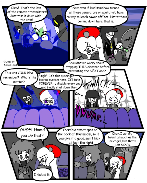
Page 218 – There’s good, and then there’s GOOD
This is another pages that just kind of bugs me, even though most of you wouldn’t know why unless I told you. As originally conceived, there was supposed to be a whole panel just of Skye staring dumbfounded at Trigger before the last panel. That turned out to be one panel too many, and I had to drop something to give the rest of the page room to breathe. Still, it feels like the joke looses something without that extra beat to underscore it.
Also, it only recently dawned on me that I’d forgotten to explain just what the heck was that thing Tabitha was looking at back on Page 209. Well, now you know… and knowing is half the battle.
(Historical Notes: Okay, Past Me? C’mere sweetie, have a seat. You see this page up here? You see all those needless diagonal lines, and all the empty white space outside them? That’s right, those are the ones. Now, think about what you just said about having to leave a panel out. Why did you have to do that?…go ahead, I know you remember, you just said it …thaaaat’s right, because there wasn’t enough space. Now look back at those panels again. What are they wasting a lot of? …SPACE, that’s good! Now, one last thing. When somebody reads a webcomic, what do you think they read it for: the writing and the jokes, or the shape of the panels? …now, now, don’t get angry, nobody’s it trouble. I just want to hear you say it. What do they read it for? The writing, that’s right. So next time, if the panel layout doesn’t leave room for the page’s punchline, maybe it’s the PAGE you should change, not the punchline? Okay? Okay. Now go play, and I’ll call you when it’s time for supper.)


Discussion ¬