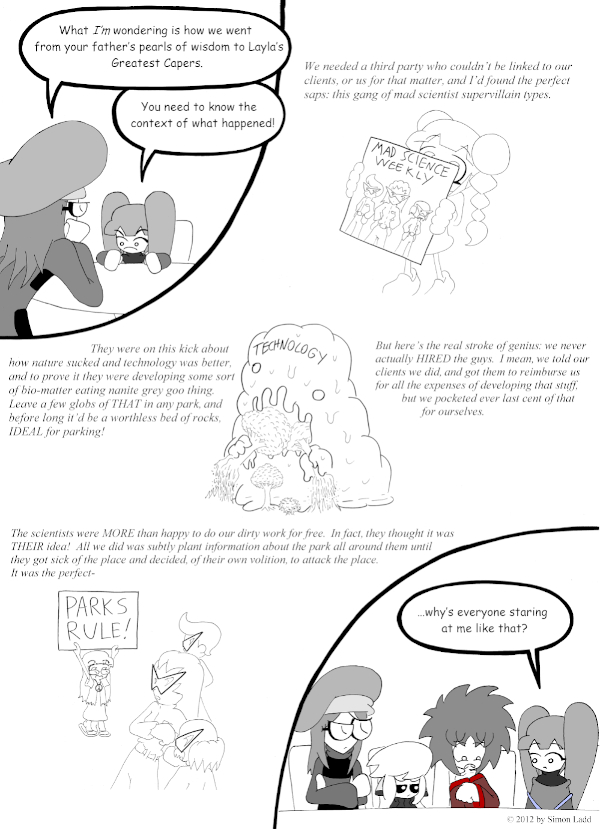
Page 475: Plans and More Plans
Oh wow, THIS was one heck of an all-nighter. You guys seriously don;t realize how close I came to just posting another half-finished page this time… in fact, this page might still be half-finished. I drew each part separately and slapped ’em all together as one again, but since they layout is kinda awkward this time (and because I didn’t have much of a rough draft to work with) I got worried that I’d run out of space for the text. Yeah, that wasn’t a problem at all. Now the pictures AND the text are too small and there’s all this wasted space everywhere. Tonight I may try again and see if I can’t come up with something more satisfying.
Speaking of satisfying, I REALLY like how those mad scientists turned out. I wanted to make them look different from the many, MANY mad scientists we’ve seen so far, and somehow I hadn’t used jumpsuits prominently yet. Also, Layla’s supposed to be holding a magazine or something, but that totally looks like she’s holding their self-titled album… AND THAT TOTALLY WORKS.
One thing that does bug me, though: Layla’s plot bears some important similarities to the one in The Killer Station of Deadly Doom. I can’t seem to come up with a scam that doesn’t somehow resemble Inception.
Speaking of which: The Killer Station of Deadly Doom!
(Historical Notes: Okay, I think this is a good place to bring this up, because it’s got some of the best examples of me both doing and NOT doing it right next to each other. As much as drawing the individual elements of the page separately would wind up being good for the comic, it took me a while to truly work out some of the finer points. For one thing, while drawing bigger then scaling down meant I could fit in more little details in a cleaner manner, it ALSO made drawing some things trickier. Ichabod’s really awkward pose in the first panel if a good example of how I can sometime loose track of where a character’s anatomy is supposed to be going if everything is spread out too far across the page. It’s DOUBLY bad if I don’ have room to at least pencil in the stuff that’s going out of frame in order to anchor the parts we DO see. What may be worse, though, is one of the most basic artsy details imaginable: the lines. It took me WAY to long to realize that scaling an image down to a quarter of what I used to do meant all the lines would only be a quarter as thick, and I’d need to ink those parts a LOT more heavily for it to turn out right. Look at that blob in the center. THAT works. I inked the outline extra thick with a regular Sharpie, and reserved my go-to ultra fine point for the trees and debris. This way, the most important part of the drawing really stands out, and the subservient details don’t upstage it. By contrast, the other flashback images just looks… faint. I really should have also given the characters here thicker outlines to make them “pop” more; they just look withered and weak otherwise. Also, that font really needed to be a big bigger. There’s a LOT more wasted space on this page than there needs to be.)


Discussion ¬