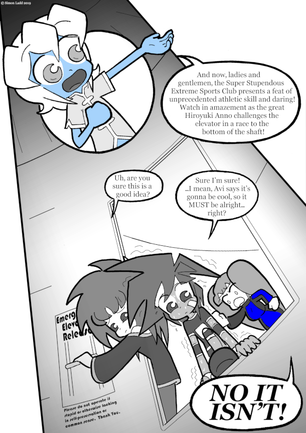
page 1108 – an extremely good idea
I designed this entire page around a wonky perspective effect. This was a really foolish idea. See what time this page is going live for proof that the third dimension remains one of my fiercest enemies.
But the good news is that, while I may have had to spend many extra hours struggling to get the perspective to at least somewhat work, I STILL managed to get the new TWC Voting Incentive posted, aaaaaaaaaaaaaand put up the new Patreon MadLib for $5 and Up Patrons! If you wanna kinda sorta help write a new Far Out There mini-comic, then head on over to Patreon and donate a few bucks to get access to the newest post and see what’s waiting to get filled in! …and of course, even if you can’t a for five dollars or more a month on webcomics, even just s single buck will still allow to to READ the comics as soon as they go up, and you can even browse around the Incentive & Patreon Gallery to check out all the other stuff that paying customers already had the chance to see!
(Historical Notes: I had a really funny idea for that fine print at the very last minute. So last minute, in fact, that I didn’t bother to spellcheck the text before shoving it into the comic. That was a mistake I only just now got around to fixing. But you know what? For all of Past Me’s complaining about the perspective, I still think the layout of this page works quite nicely. It would have been a lot BETTER if it were more clear that there’s an elevator hanging right above them. Like, I dunno, some “THIS SIDE DOWN” warning labels on the bottom or something like that. But then, that’d require adding more text at the last minute, and we saw how well THAT worked…)


Don’t be silly, Layla. Elevator-shaft diving is a common sport activity on the Exposition, and completely safe so far. Both Avatar and Stilez have done it in previous strips, and nothing bad happened! Therefore: 100% safety rate!
Well, the numbers don’t lie.
JUMP! JUMP! JUMP!