2021 Christmas Presents – page 3
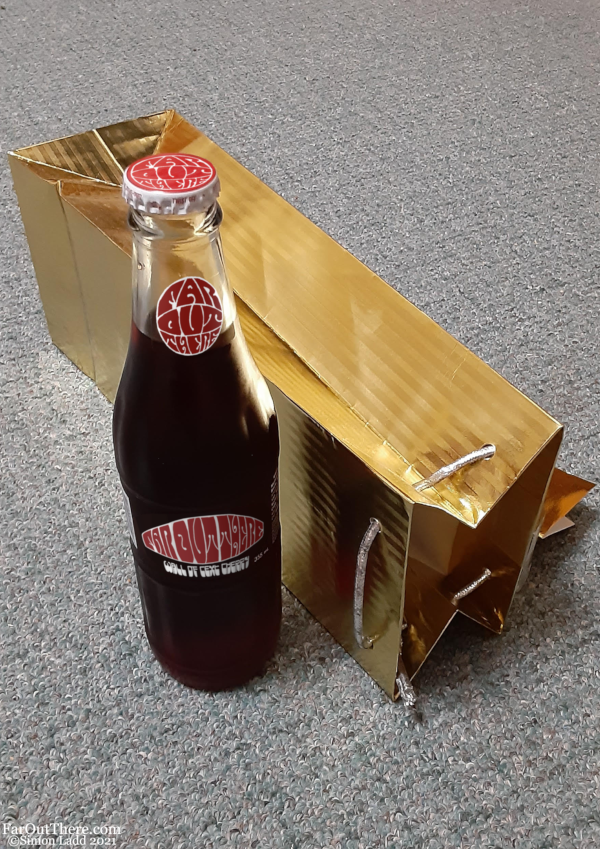
I’ve said it before and I’ll say it again: as hard as it may have been for other people to read, I still think the old psychedelic title font makes for a great logo. I’d totally still use it as the Far Out There brand logo no matter what the website banner looks like now. Oh, and speaking of “hard to read,” the bottle says “Wall of Text Cherry.” The font looked a lot more legible when I was putting the logo in place, and then I zoomed out to look at the page in normal size…
OH HEY! Don’t forget! Top WebComic Voting Incentives are finally back! A new one went up yesterday, so if you haven’t already seen it, go vote and discover what the new incentive series is!


Discussion ¬