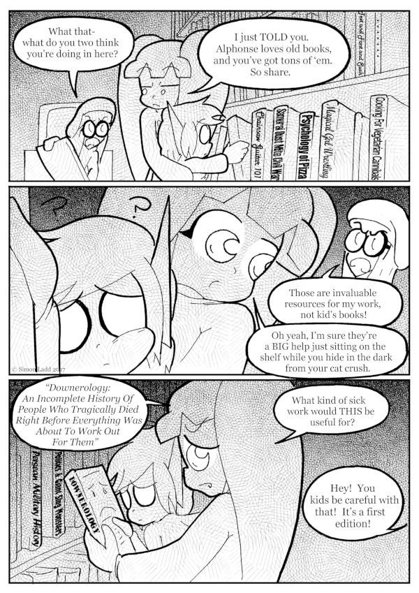
page 910 – Take a Look, It’s In a Book
I’m kinda miffed over this one. I wanted this page to still have a dark, shadow-y look along the lines of the previous page… except not ACTUALLY the same as that page, since I wanted the text on all those book covers to be legible. I was afraid that doing the lighting and shadow via solid colors would obscure the text too much, so I went with the layers of screen tone instead… which DEFINITELY obscured the text, probably more than doing things the other way would have. I didn’t even bother putting text on half the books in the end, pretty much defeating the whole point of the page. Dang it, Ichabod! Turn your lights on!
On a far less frustrating note, go check out the new Voting Incentive, which turned out to be one of my favorite things I’ve drawn in a looooooong time …and will no doubt spark some delicious rampant fan speculation 🙂
(Historical Notes: The Voting Incentive in question is that one with a wall full of numbered Stilezes in science-y pods, with one of them broken and empty. And yes, it did indeed turn out to be HIGHLY controversial and remains of questionable canonicity.)


That’s probably not even actually Ichabod’s book. He borrowed it from Maunu.
OH MY GOSH, they really would have fun swapping stories about being miserable, wouldn’t they? That totally needs to be a thing! (and it’d inevitably end with Ichabod deciding she’s too self-absorbed even for him to put up with for too long)
…Maunu adds “being rejected by Ichabod” to list of things to be despondent about…
…and he didn’t even return her book….
🙁
Is that a reading rainbow reference?
It sure is.
…but you don’t have to take MY word for it!