Stilez vs. Christmas – page 6
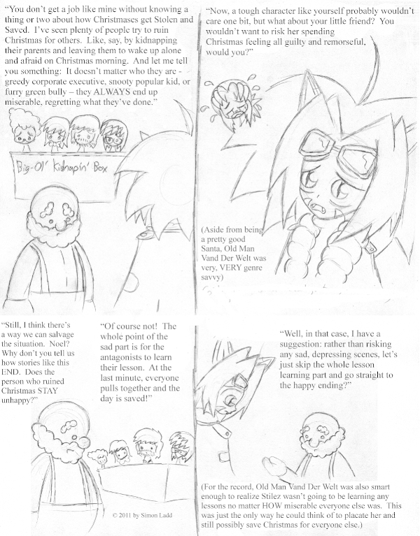
ACK, TEXT SWARM! Sorry ’bout that. I easily could have spread this information across two or even three pages, but I’m not sure the pacing would have worked that way. A bunch of heads sitting around tossing meta-commentary at each other isn’t what we all came here to see, after all. (…right?)
I wish I’d been able to come up with more footnotes for other pages. I really like ’em here, but it’s weird for that commentary to just start appearing suddenly. Does it show that I didn’t have time to do many rewrites?
(Historical Notes: Okay, now you can start to see the REAL annoying thing about the art in this story, or more specifically the pages BEHIND the art. I wanted to replicate the effect of the previous year’s “pencil on paper” look, but with multi-panel pages instead of a single drawing and just one block of text. That meant a lot of re-scaling things and moving stuff and combining multiple drawings, all of which resulted in the paper texture visibly not lining up. This page already looks like a cut ‘n’ paste ransom note, and it’s only gonna get worse as we go.)


Discussion ¬