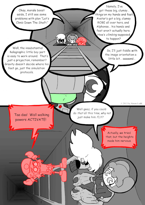
page 545 – Spider Alphonse!
Well THIS took a lot longer than it should have. I’ve been using the whole “It’s so dark in the ship, there’s no point in drawing detailed backgrounds” excuse for way too long, so I deliberately convinced this page as an excuse to do something elaborate. Yup, the whole point here was to go wild with the blur and shading effects in order make an eye-popping “He’s hovering right over a bottomless bit!” 3D-ish thing… and after many extra hours of fiddling, I don’t think it worked. The interiors of the ship are too smooth and featureless for the Blurry Distance trick to properly work. A big room with lots of little details in it, maybe, but not these plain walls. Also, the REALLY tricky perspective in the last panel got the better of me. In trying to keep all the characters visible, I kind of shoved Alphonse out of the spot he needs to be in for the effect to work. There should be more direct contrast between the dark, blurry depths and his bright, sharp figure, and he’s too off center for that. I wouldn’t be as annoyed over this if I hadn’t added and extra… MANY hours to the editing process trying to get this to work.
And speaking of things that didn’t quite work, MAN Avatar’s hair is hard to draw from above/behind!
(Historical Notes: Wait… it’s only just hit me that this page looks weird… do the elevators look round instead of square in other parts of the comic? I have a feeling I’ve been drawing both them and their tubes round, since that’s what the turbolifts on Star Trek look like. So… why is this one a square? Am I imagining things? I really can’t remember off the top of my head.)


Discussion ¬