Page 219 – Like black holes in the sky…
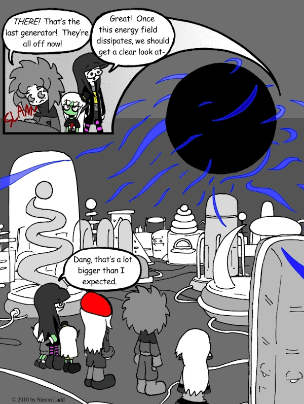
Now THIS page I REALLY like. It’s been a while since we had a nice, big, dramatic panorama like this. Best of all, it’s kind of a happy accident!
See, when I first started working on this thing I did a whole lot of complicated shading on the machines, making ’em all dark and stuff. It looked nice and all, but something just seemed… “off” about the page. Long story short, I did something stupid, crashed the art program before I’d saved, and had to start over with the most recently saved draft. Said draft had all the characters, energy effects, and the floors colored in, but all the machinery was still untouched. AND THAT WAS IT! By busying up all the techno stuff, I was diverting attention away from the ACTUAL center of attention: the big black void! Yay!
…no, this artistic decision was NOT motivated by the fact that it meant this page would only take half as long to finish. What would give you THAT crazy idea?
(Historical Notes: And ten years on, I STILL really like this one. I still reflexively want more of the machinery to be colored in, but leaving them so bright allows for a much greater contrast against the big black void. This is the sort of image that would make for a good book cover.)


Discussion ¬