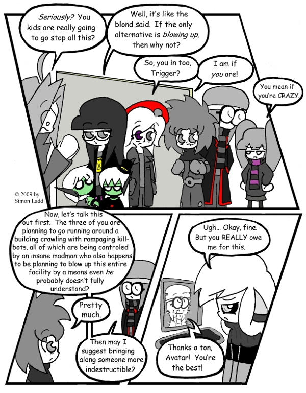
Page 198 – …plus a special guest star!
Well, look who it is! I actually had to take a minute and remind myself how to draw Avatar, it’s been so long. ^___^;;;
To all you nitpickers out there: Ichabod calling Avatar here is NOT contradicting page 196. If you’ll recall, Ichabod specifically says that the robots have cut INTERNAL communications, and Avatar’s OUTSIDE… don’t ask me to explain how that work, though.
Oh, and check out that page number! We’re getting close to a certain number that starts with a 2! I WAS hopping to do a big revamp of the whole site to mark the occasion, but page 200 has the misfortune of landing at the end of a VERY hectic week for me. I’ll get SOMETHING done to the site for the big two-oh-oh, I’m just not sure how much yet. EVENTUALLY, I’ll be overhauling the entire page layout, add new buttons, and generally make everything better and stuff, so bear with me!
(Wow, I just had some unfortunate deja vu of my old, mismanaged Digimon fansite… which is unfortunately going down with Geocities into the infinite abyss)
(Historical Notes: Gosh, my whole life is just a chain of broken-down websites, isn’t it? I mean, I guess the Geocities example is a lot worse since that one’s actually GONE rather than just abandoned, but still. Oh, and insert your own observation about how ironic notes about website layout and design seem now. I’m running out.)


Meh, buttons are overrated anyway.
It’s funny how design trends change. I remember back when non-text links were a luxury because of how long the button images took to load, then they became the norm as speeds increased, so that text links looked sloppy and amateurish. Then there was a backlash to big button images and text-based layouts became cool again, and that’s what my current site-design philosophy is based around… except that NOW there’s a whole wave of sites designed for phone browsing that actually LIKE big image buttons again! How’s anyone supposed to keep up?