page 1121 – just a few notes
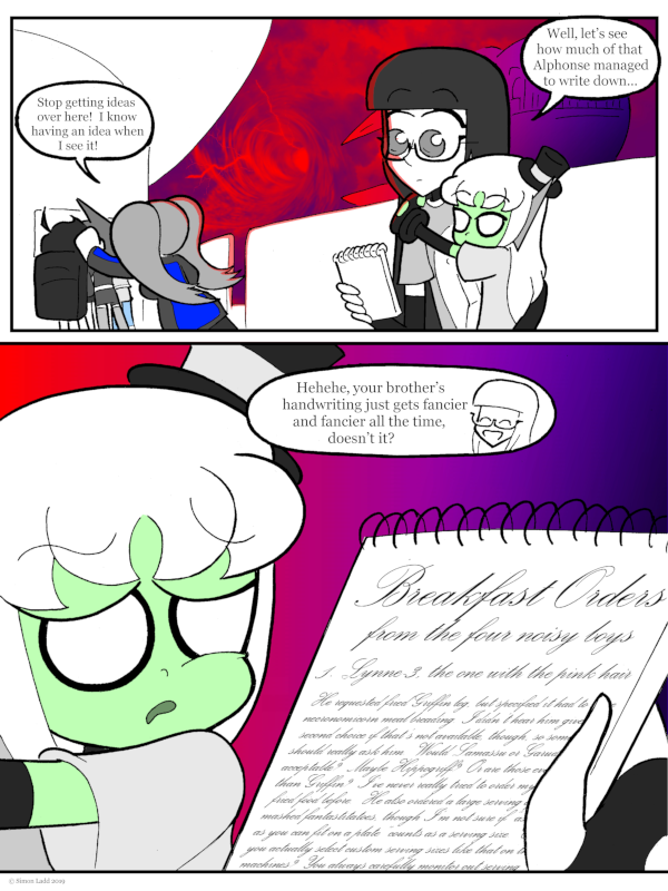
(Historical Notes: Okay, I know for a FACT that Past Me was talking about this back on the original version of this comic, but MAN that cloud vortex effect turned out better than it ever should have. There’s like, four or five different elements to that image, and that’s BEFORE I started messing around with the colors. I wish I’d picked an easier font to read for Alphonse’s “handwriting,” though. Not just because it’s so hard to make out what it says, but because it’s hard to make out how FANCY it is when most of the lines are that small!)


Discussion ¬