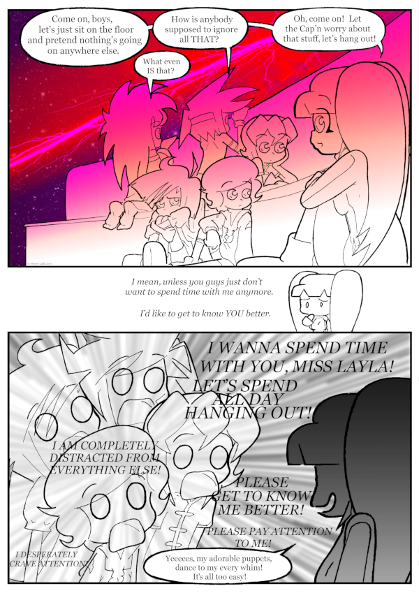
page 1114 – it’s made of red and purple
(Historical Notes: The Alt Text on this page makes a lot less sense now that we’re not on SmackJeeves anymore and I was able to use every one of the previous page’s frames as intended. Also, while I like how MOST of the art on this page turned out, especially all the different bits of body language displayed in the first panel, I’m a bit astounded by how messy the inking on the Layla silhouette is. It looks like I had to scale it up waaaaaay too far and didn’t do ANYTHING to clean the lines up, even though it’s easily the simplest bit of art on the whole page. I’m sure Past Me has some excuse about scrambling to get ready for Animazement or something like that, but that still doesn’t explain why the easiest part of the page is the one that wound up ugly. I mean, I know why it’s STILL ugly, because all the gradients on the page would make it too hard to change anything, but that wasn’t an excuse back THEN.)


Discussion ¬