page 770 – Biiiiig Bubble Bath
OKAY, so here’s the deal: I should be down in Atlanta by the time this goes up, so I don’t really “KNOW” that any of the stuff I’m gonna talk about is actually up. This is the first con I’ve been to since I started doing all the extra Patreon stuff, and I’m still not quite used to that new schedule WITHOUT the added obstacle of planning around a roadtrip. Still, if I manage to get everything loaded properly before I leave, there ought to be a new Far Out There page for the Patreon supporters, as well as a new Voting Incentive for everybody. I especially hope the latter goes up properly, because it might be my favorite Voting Incentive I’ve drawn EVER.
…anyway, I’m going to TRY to have Tuesday’s update taken care of before I leave for the con too, so that I don’t have to stop working on the batch of Conventional Wisdom comics for a day. Emphasis on TRY, though, so don’t be too shocked if there isn’t a new Voting Incentive then (but hey, having an extra few days to look at this awesomeness is cool, right?)
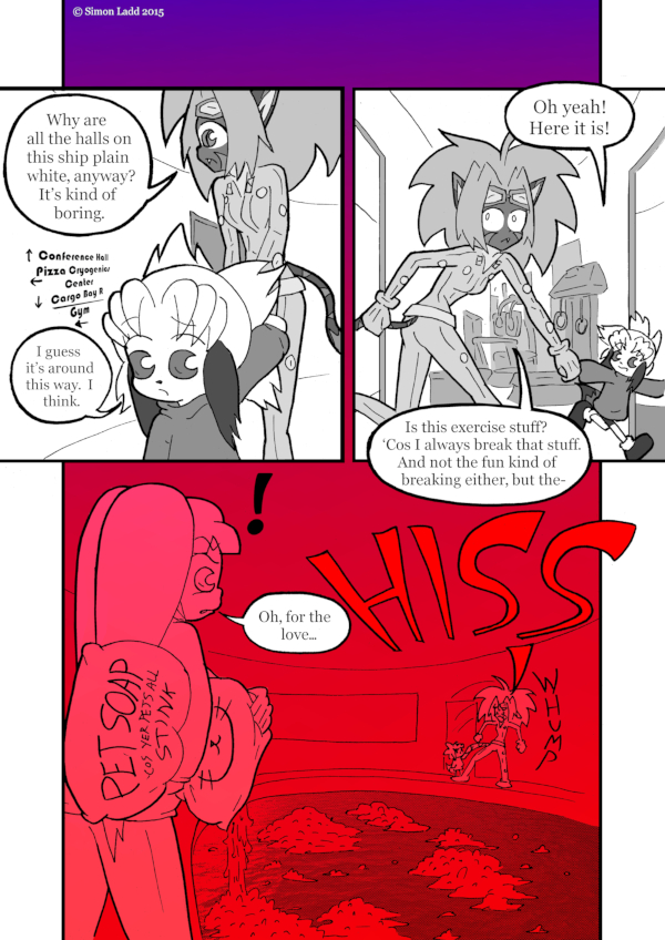
Oh, and I guess I need to actually say something about the comic itself, don’t I? Well, I think I drew the pool and the gym a lot better last time we saw them, mostly because I was in much less of a hurry that day.
(Historical Notes: …and this page is somewhere in the MIDDLE of the good/bad gradient usage. It tends to come across as less lazy when there’s some degree of “dun dun DUUUUUN” moment happening, and Stilez reacting to the pool sort of qualifies… though the fact that we’re only seeing her from the far side of the room sort of give away that this wasn’t the original intention. As you can hopefully see from the original commentary, I was ACTUALLY just looking for corners to cut in order to get enough pages done to cover my convention trip. The tempting thing about slapping gradients down is they LOOK flashier than just posting plain line-art, even though they don’t take much more time than that, which often leads to me using them where they don’t need to be used just as a time saver. In this specific case, it’s a tad less egregious thanks to the other trick at play: the top panels overlapping with the bottom one. Aside from just looking really cool, it inadvertently creates a bit of a sense of suspense, like you know something is coming down there even before you read that far. That was ABSOLUTELY not on purpose, though, and we’re gonna see some more pages later on that don’t have that excuse for their wonky layouts.)


Discussion ¬