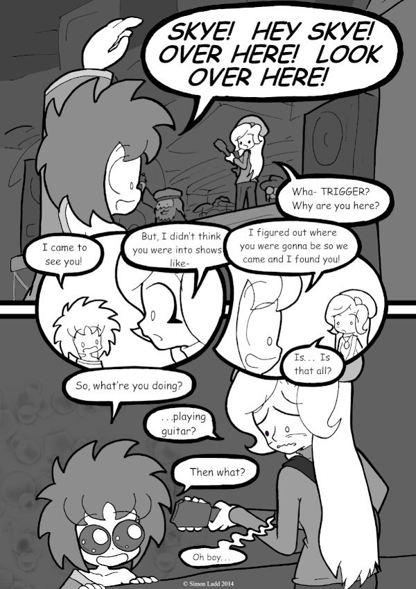
page 650 – A Promising Start
It’s been a while since I straight up complained about a page (and I mean REALLY complained, not just a little nitpicking) but the first panel here is all wrong. Skye should be the one in the foreground, and Trigger should be running up in the distance, not the other way around. After all this looking for Skye, actually finding her should feel like a bit of a big deal. Instead, she’s stuck in the background like an afterthought. Well, I guess that’s the sort of thing that happens when you forget to do a decent rough draft beforehand (I’ve been having a really forgetful week)
Well, I’m somewhat more pleased with today’s Voting Incentive, where the flashbacks start overlapping with stuff we’ve seen before!
(Historical Notes: Past Me spent so much time complaining about the top half of this page that there wasn’t any room to point out how terrible Skye was drawn in the bottom half. I managed to perform some MAJOR re-editing surgery and make her look a bit more natural here, but it’s still not great. See, this is but one of the reasons these re-posts keep taking so long.)


Discussion ¬