page 633 – Community Bulletin Board
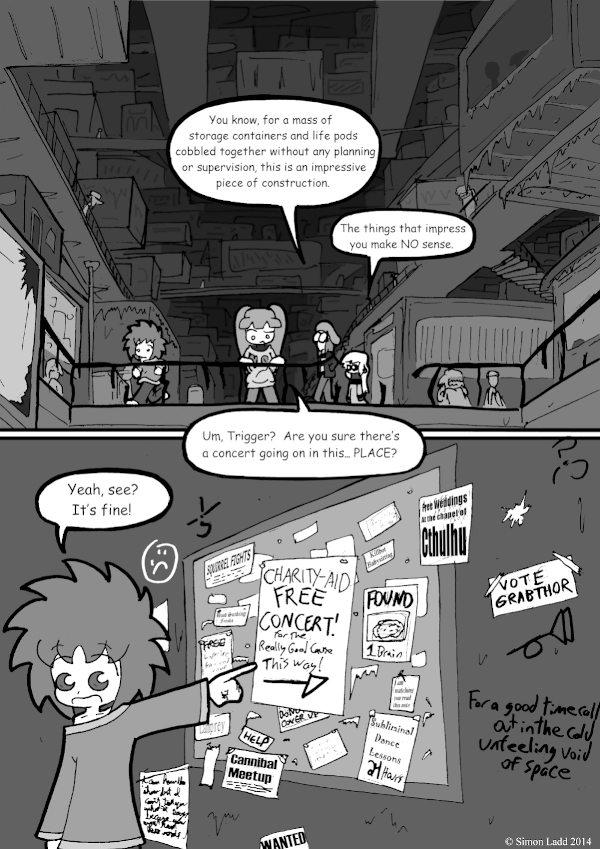
MAN that first panel gave me a hard time. I guess it turned out alright, but I can still complain about a lot. In my head, Araknil Station looks like some kind of combination of a trailer park and Kowloon Walled City. The idea beaning that the “actual” station is just the core, while all the people live in a make-shift shell of smaller units welded together. As it turned out, though… I dunno, it looks more like the end of Raiders of the Lost Ark than I’d intended. Oh well, it still looks really dark and grimy, and that’s what really matters.
Also, just in case you missed it last week, you should totally go back and read the theorizing in the comments about the Ichabod/Avatar timeline. I’m still very proud of the level of geekery we achieved.
And speaking of Avatar, New Voting Incentive is… weird. Very weird
(Historical Notes: I started experimenting more with burring effects to try and give the stuff in the background a sense of depth around this point. It didn’t really work out as well as I’d hoped, largely because I still hadn’t mastered the art of ACTUALLY HAVING MORE THAN ONE LAYER WHILE WORKING ON THE COMIC so there wasn’t much I could do while still keeping the foreground clear.)


The things that impress Ichabod seem like they fall under a “How the hell did they succeed” category, possibly because he knows so much about “Normally Impressive Things That Took A Lot Of Prior Planning To Succeed”. Which also suggests that Ichabod would be impressed by whoever made Stillez, due to the fact that they managed to make Stillez. On the other hand, he finds Stillez personally annoying, so… *shrugs*
Don’t forget, Ichabod has an even more encyclopedic knowledge of “Things That Took A lot Of Planning Yet Somehow Managed To Fail Spectacularly Anyway.”
So things that somehow succeeded without any, or minimal, planning are even more impressive! Thank’s for confirming that Ichabod’s impressed by the “How the hell didn’t this end catastrophically” category. Depending on how the next 30 years go, he might be the type of person who is impressed with the US’s legal system in this half-century. Or it could become one of the notes in his books about how large legal systems failing catastrophically when not appropriately updated due to societal change. Either or, depending on the results.
Of course the whole reason she even knows him is because he was interested enough in her to
go on a datedo a first-hand observation research project on something that the entire rest of the galaxy did their very best to stay the heck away from. He must have, at least at one time, found her very fascinating.This reminds me, you need a spoiler-tag mask option so we older commenters don’t ruin the surprise for new readers who are reading through from the beginning. Of course, I totally suspected the Stilez+Ichabod ship from the beginning.
(Of course I say that having no idea how easy or difficult it is to implement a spoiler-tag)
…and even if I did know what I was SUPPOSED to do to implement it, we’ve seen that’s no guarantee it’d actually work like it’s supposed to.
He did, but we do need to put “date” in quotation marks since we’ve heard a lot of contradictory claims about how that whole experience went down.
Also: sign right behind Trigger: “I can hear the ???? but I can’t tell you what it says in case ???? ???? ???? ???? ????”. That’s all I’ve got. Anyone else want to try?
Oh man, it took me a second to remember what that was about myself. Back when I lived in DC, there was some probably-crazy person who’d go around the Northwest tying sheets of “poetry” up on random objects along the sidewalks. I’m pretty sure this is a quote from one of them: “I can hear the show but I can’t tell you what it says because you won’t read these words”
…at least, I THINK that’s what it says. Sadly, my own handwriting is actually worse than the crazy person’s was.
Nice shout-out to “The Crying of Lot 49” there.
Thanks! I tried to cram as many nerdy references into the graffiti as I could.